
DIGITAL / GIANT EAGLE - MYPERKS
A rewards program shoppers had to do math to use.
myPerks gave the most value to shoppers who knew how to work the system. The redesign made everyday shoppers feel rewarded just for shopping.
Loyalty program redesign
Customer research, program design, journey mapping, UX and UI design
17
types of physical and digital touchpoints
THE PROBLEM
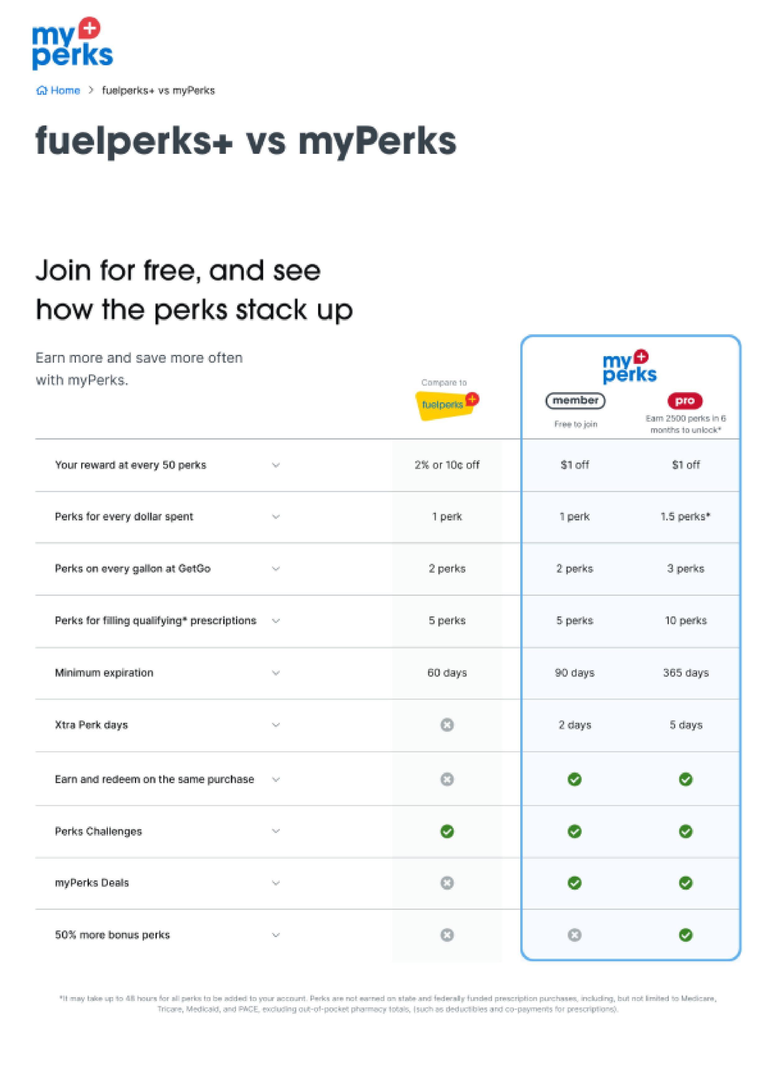
Shoppers had to do the math.
2
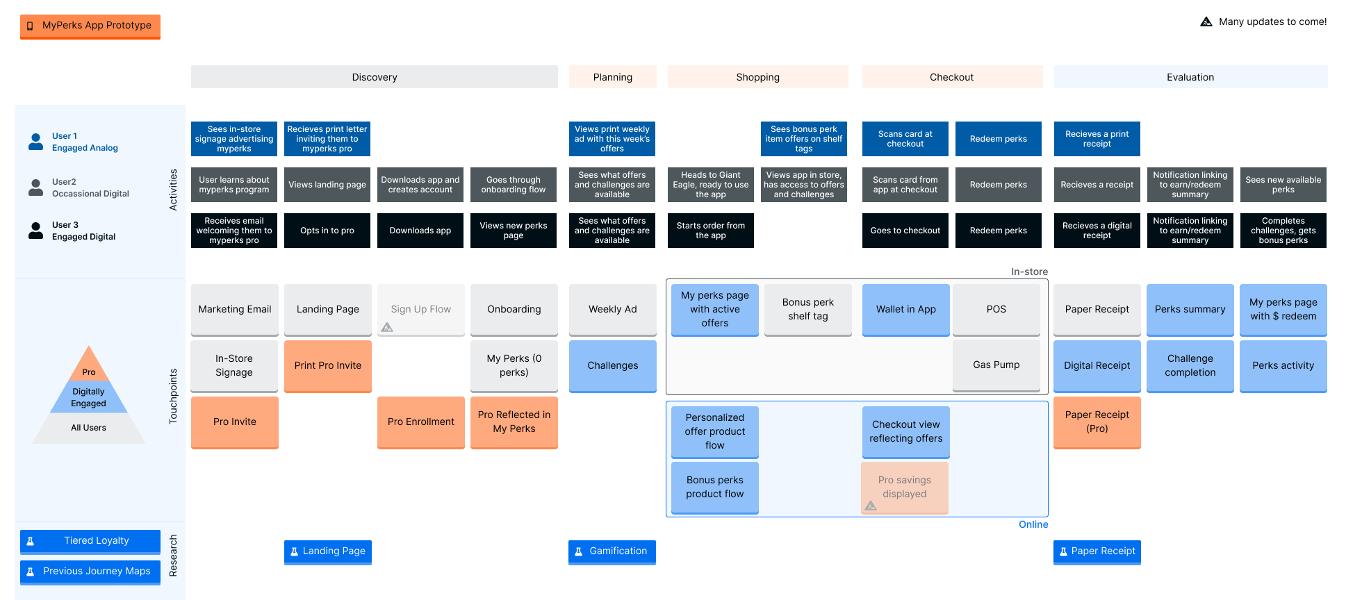
end-to-end customer journeys mapped
Grocery rewards worked by the dollar and fuel rewards worked by the gallon, so shoppers had to figure out which was worth more. Customers who knew how to work the system got the most out of it. Everyone else felt shortchanged and found the program hard to keep track of.
3
easy steps in the new program: shop earn, redeem

THE APPROACH
Redesigned the program, not just the screens.
Interviews with 17 customers showed that people who understood the program liked it more. A loyalty program shouldn't require customers to become experts in it, so the redesign simplified the program itself around three steps: shop, earn, redeem.
Customer interviews, behavioral data and concept testing.
Simpler signup, using information from the shopper's existing Advantage Card.
Balances, expiration dates and rules shown at every step, so shoppers always know what they have.
A way to add a receipt later if a shopper forgot to scan their card.
Smaller rewards along the way, so lighter shoppers can see progress.
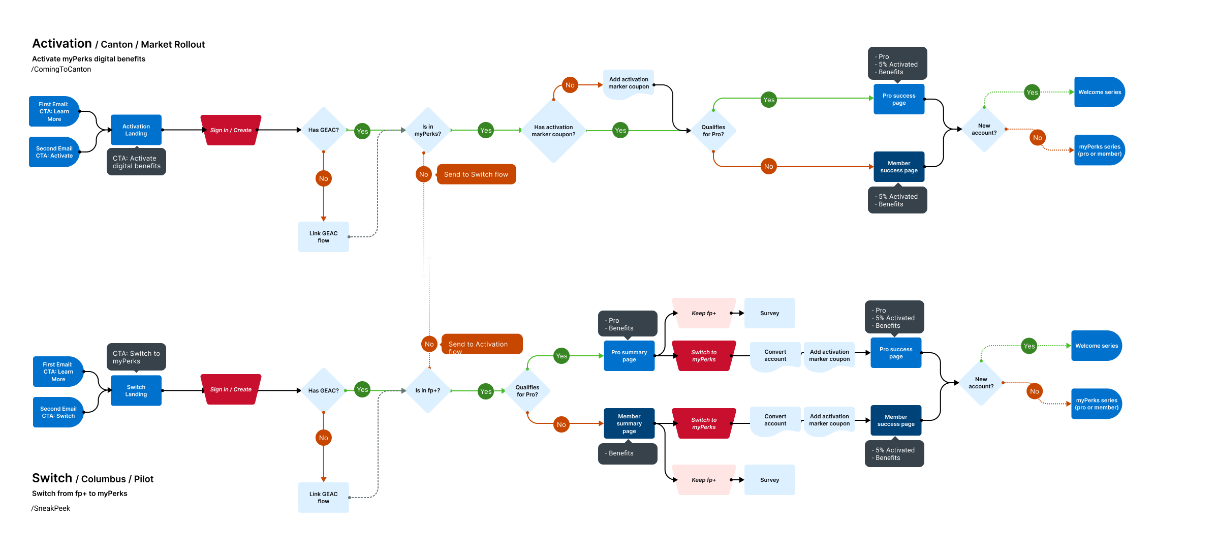
SIGNUP AND SWITCH FLOW
EXPERIENCE MAP
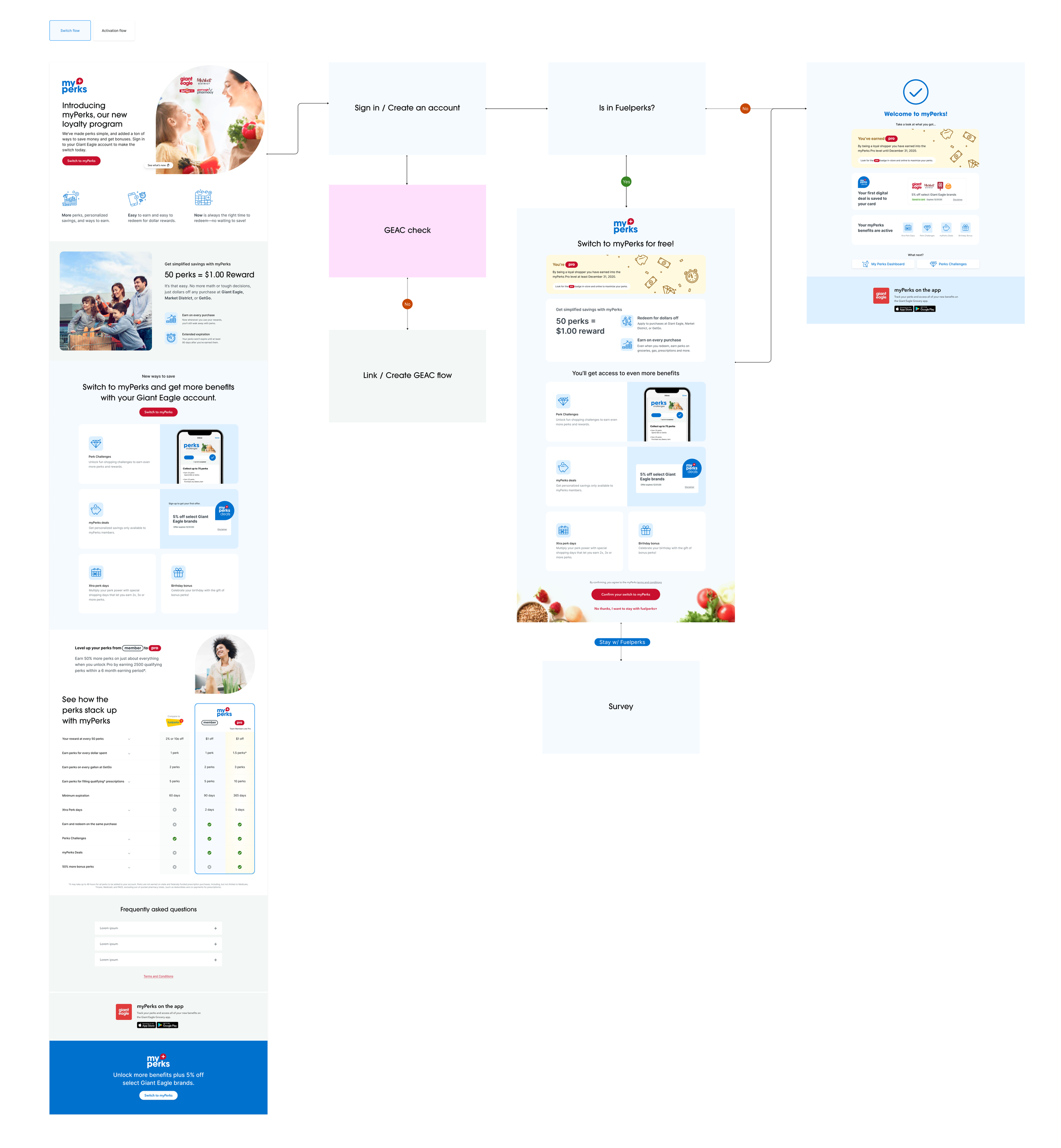
DIGITAL UNLOCK FLOW
DESIGN LEAD
Jenny Lu
UX/UI design
THE RESULT
Simpler rewards, launched in market.
The redesigned program launched in its first market while Jenny was at Giant Eagle. Shoppers no longer had to work out which reward was worth more. They shop, earn and redeem.
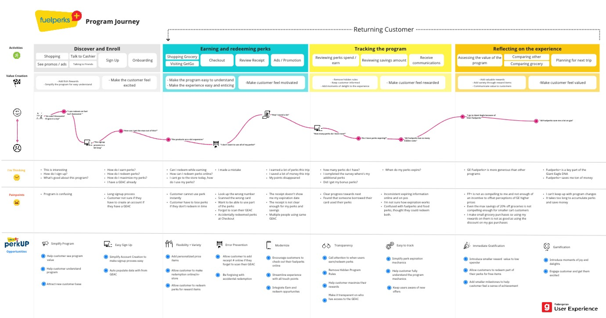
PROGRAM JOURNEY WORKSHOP
NEXT STEP
Have a product that's hard to use?
Tell us where people get stuck. Blair will tell you what it would take to fix it.