
DIGITAL / GIANT EAGLE - SCAN PAY & GO
One checkout experience across every screen in the store.
Scan Pay & Go lets shoppers scan items as they shop and skip the checkout line. It only works if the kiosks, scales, checkout stations, emails and website all tell the same story.
In-store checkout system
In-store research, journey mapping, kiosk and screen design
5
types of physical and digital touchpoints
THE PROBLEM
Shoppers were getting lost between screens.
2
end-to-end customer journeys mapped
Giant Eagle was getting a high volume of complaints about how Scan Pay & Go worked in the store. Each screen had been designed on its own, so the steps didn't connect.
3
in-store stations redesigned: kiosk, scale and checkout

THE APPROACH
Watched shoppers in the store, then designed the whole system.
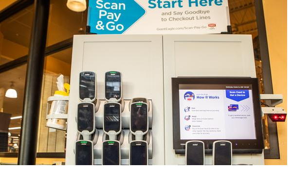
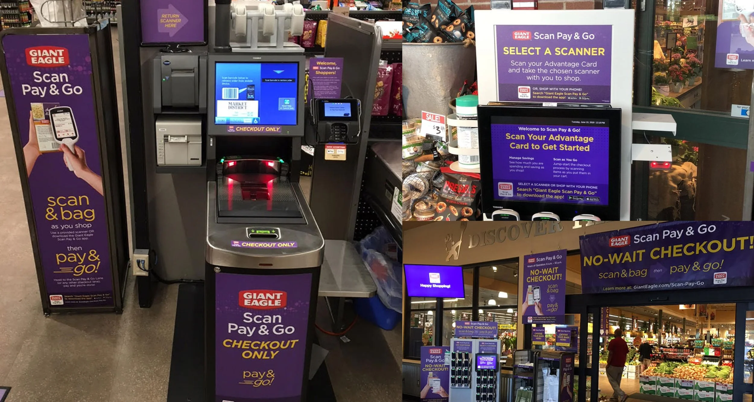
An in-store study showed where shoppers got stuck. The store was noisy and crowded, so the screens had to guide people in the moment, not just display instructions. Instead of fixing single screens, the redesign covered every point a shopper touches.
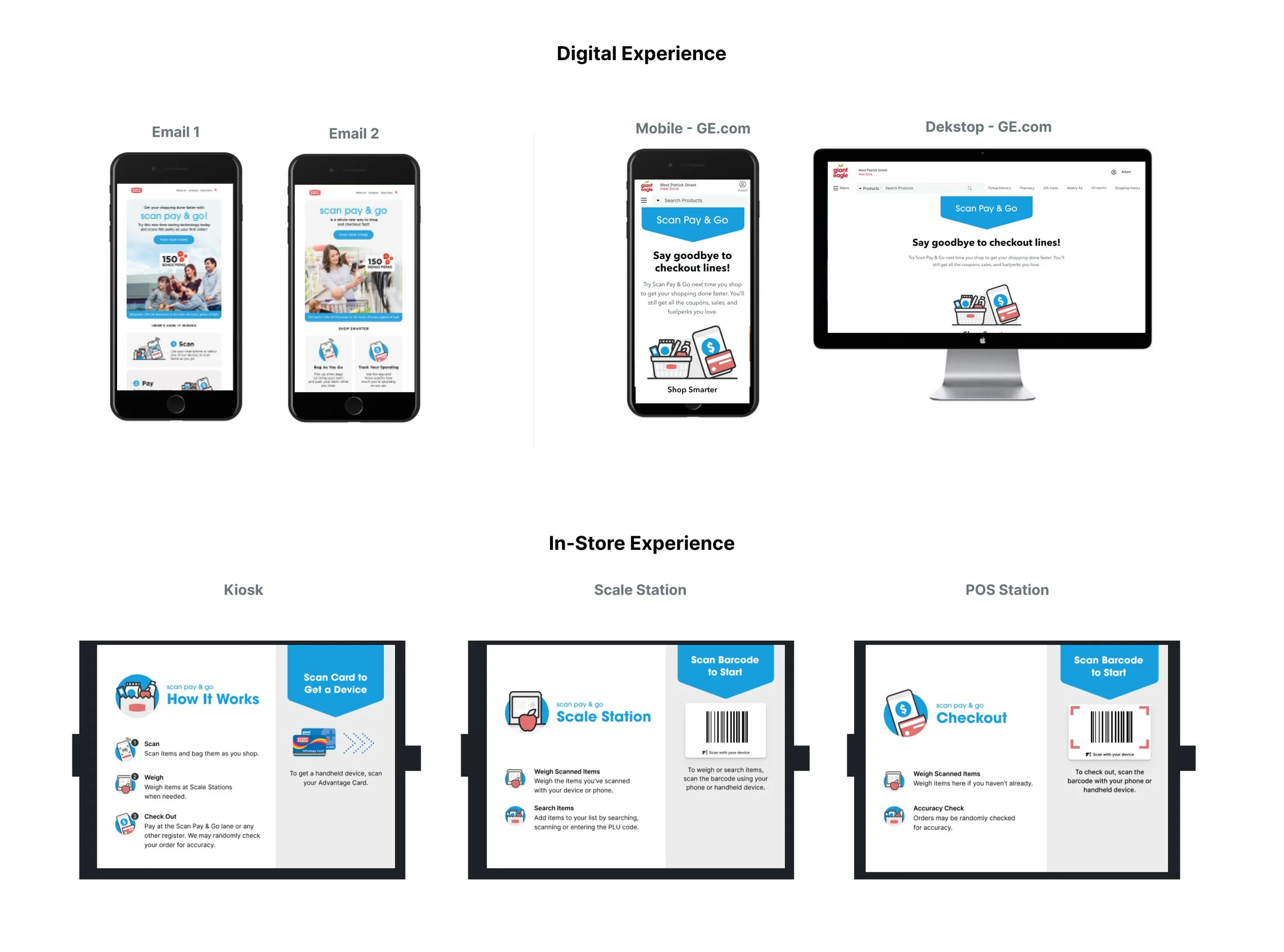
Kiosks where shoppers pick up a scanner.
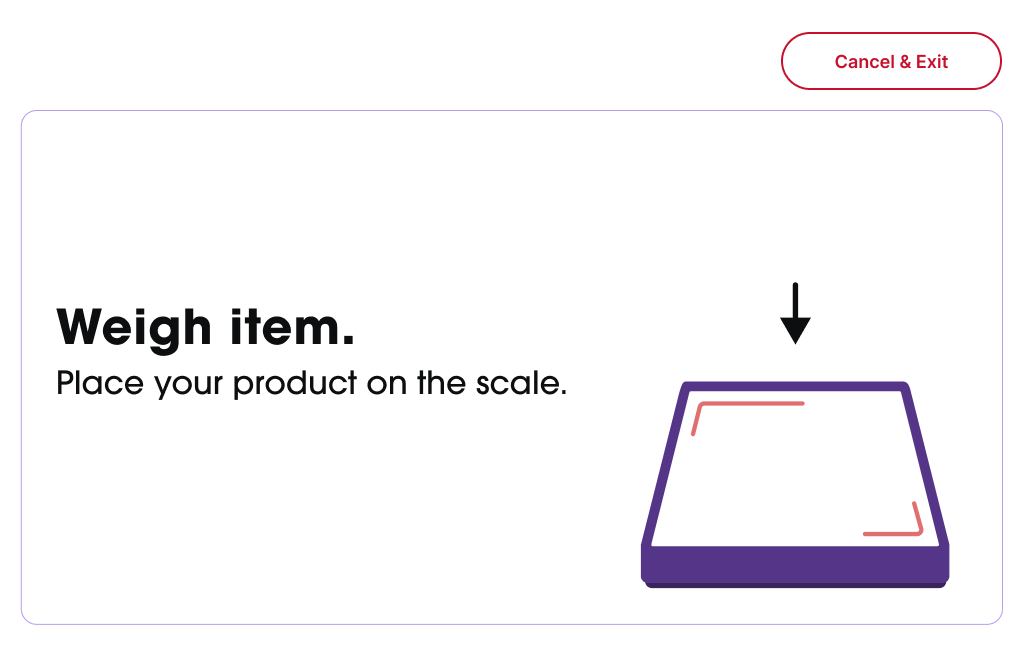
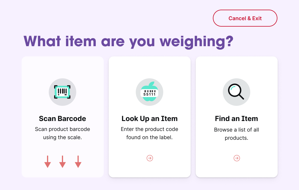
Scale stations for weighing produce.
Checkout stations.
Emails and web pages that explain the program before shoppers arrive.
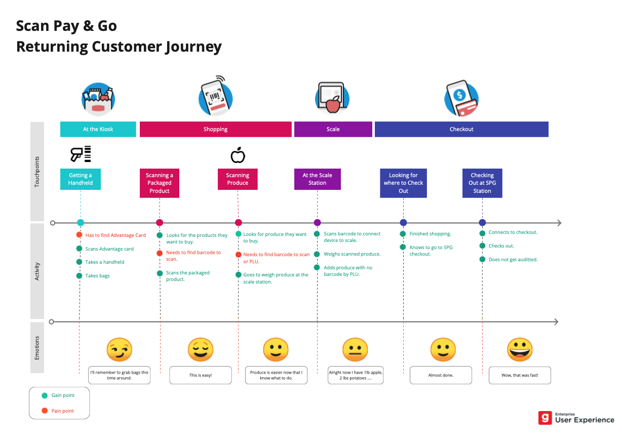
Journey maps for new and returning shoppers.
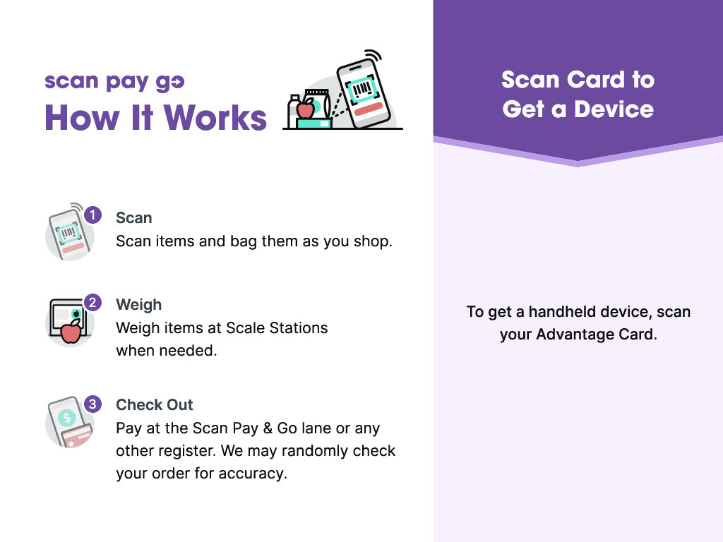
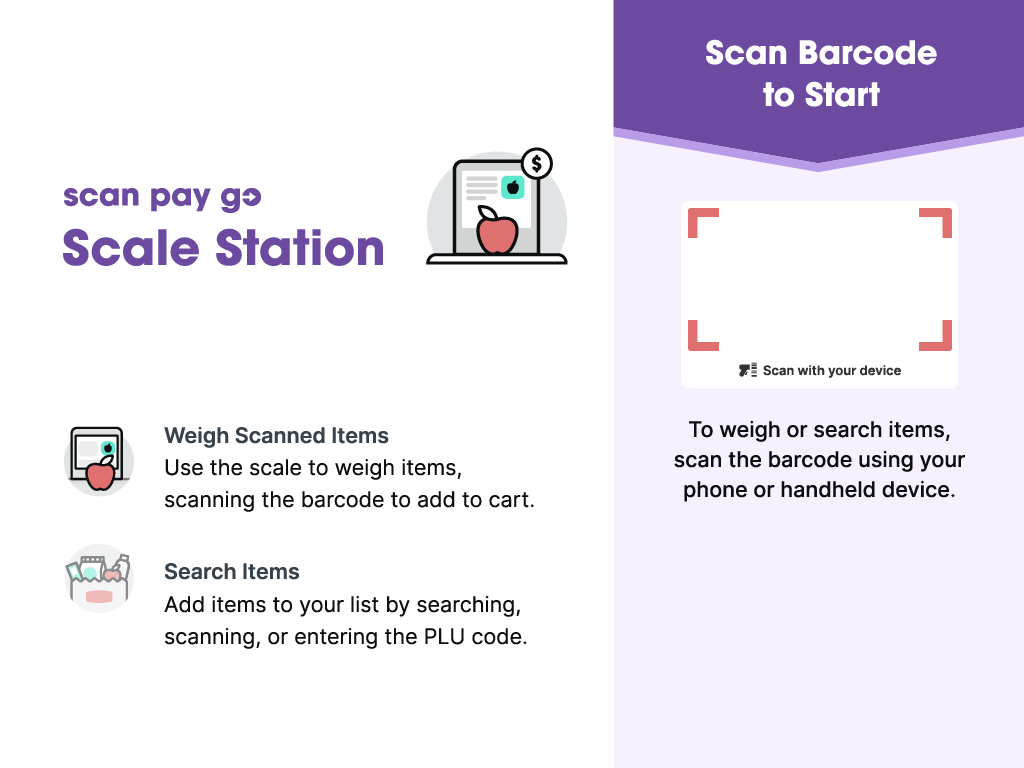
RETURNING SHOPPER JOURNEY
RETURNING SHOPPER JOURNEY
NEW SHOPPER JOURNEY
NEW SHOPPER JOURNEY
DESIGN LEAD
Jenny Lu
UX/UI design
RETURNING SHOPPER JOURNEY
THE RESULT
A consistent experience, start to finish.
The redesign launched and was refined with customer feedback, and complaints dropped afterward. It gave Giant Eagle one consistent system across five types of touchpoints, plus a journey framework to guide future decisions. It's the kind of project where screens and physical hardware have to work as one product.
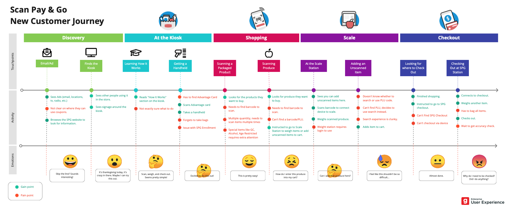
NEW SHOPPER JOURNEY
NEXT STEP
Have a product that's hard to use?
Tell us where people get stuck. Blair will tell you what it would take to fix it.